Transforming a charity’s brand – in more ways than one
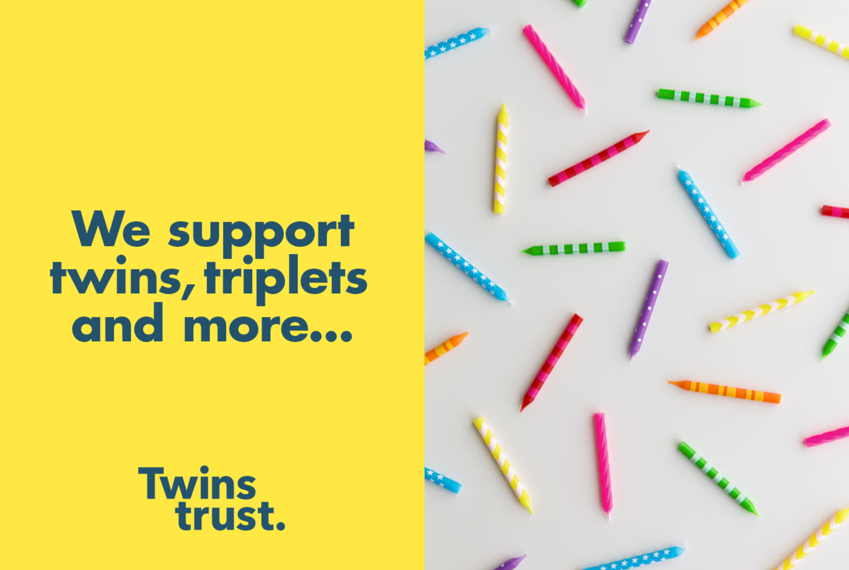
Red Stone has transformed the brand identity of the UK charity that supports families with twins, triplets, and more. The most obvious change is the birth of a new name – Tamba (The Twins and Multiple Births Association) has become the Twins Trust.


A vibrant and distinct personality
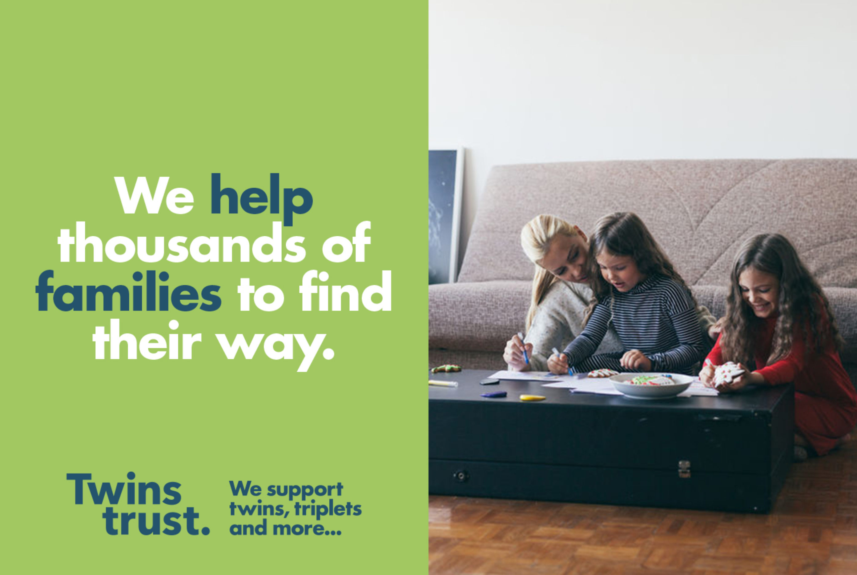
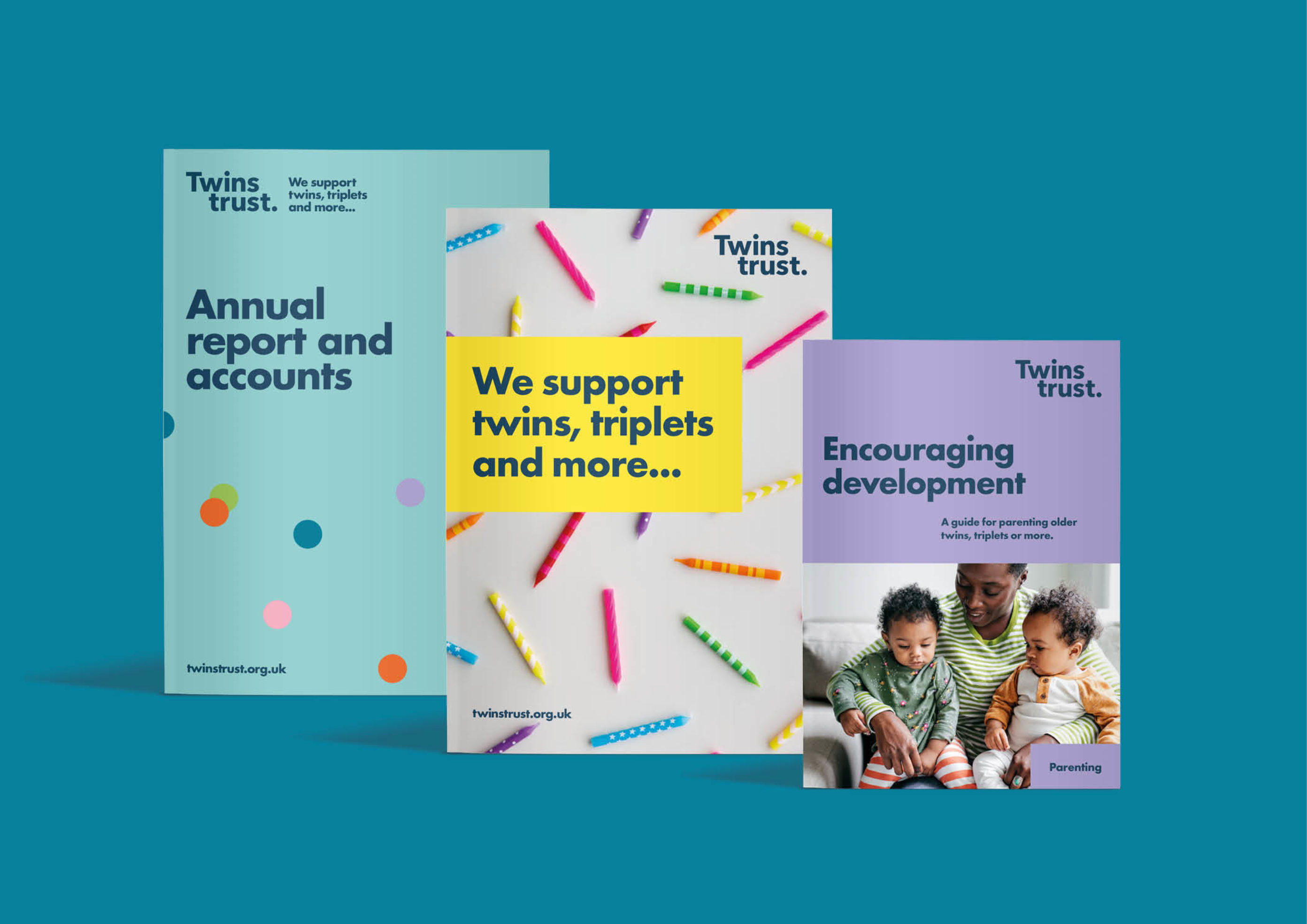
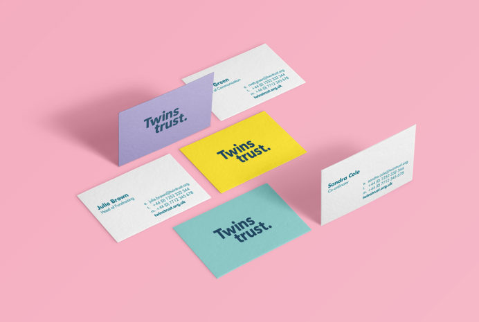
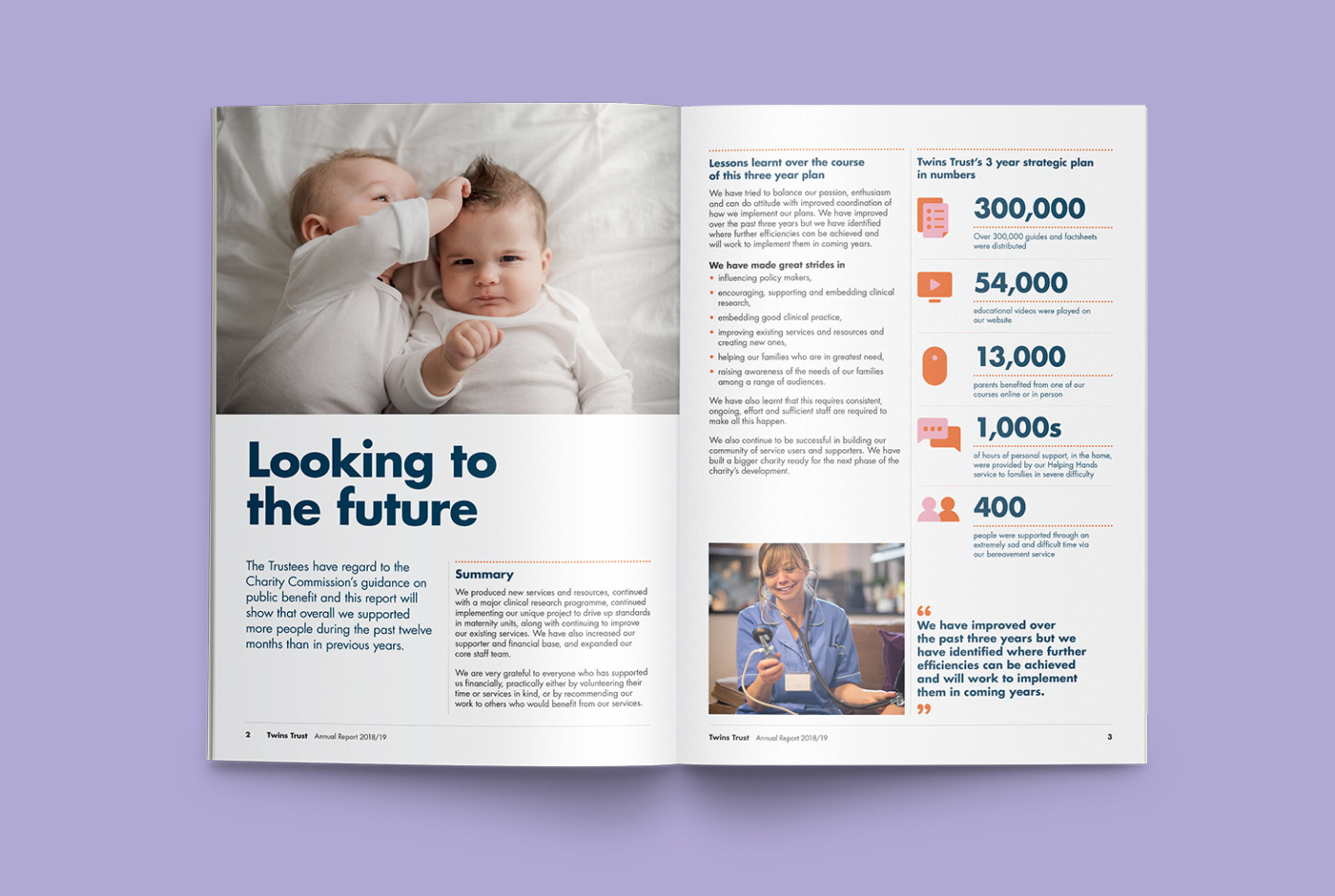
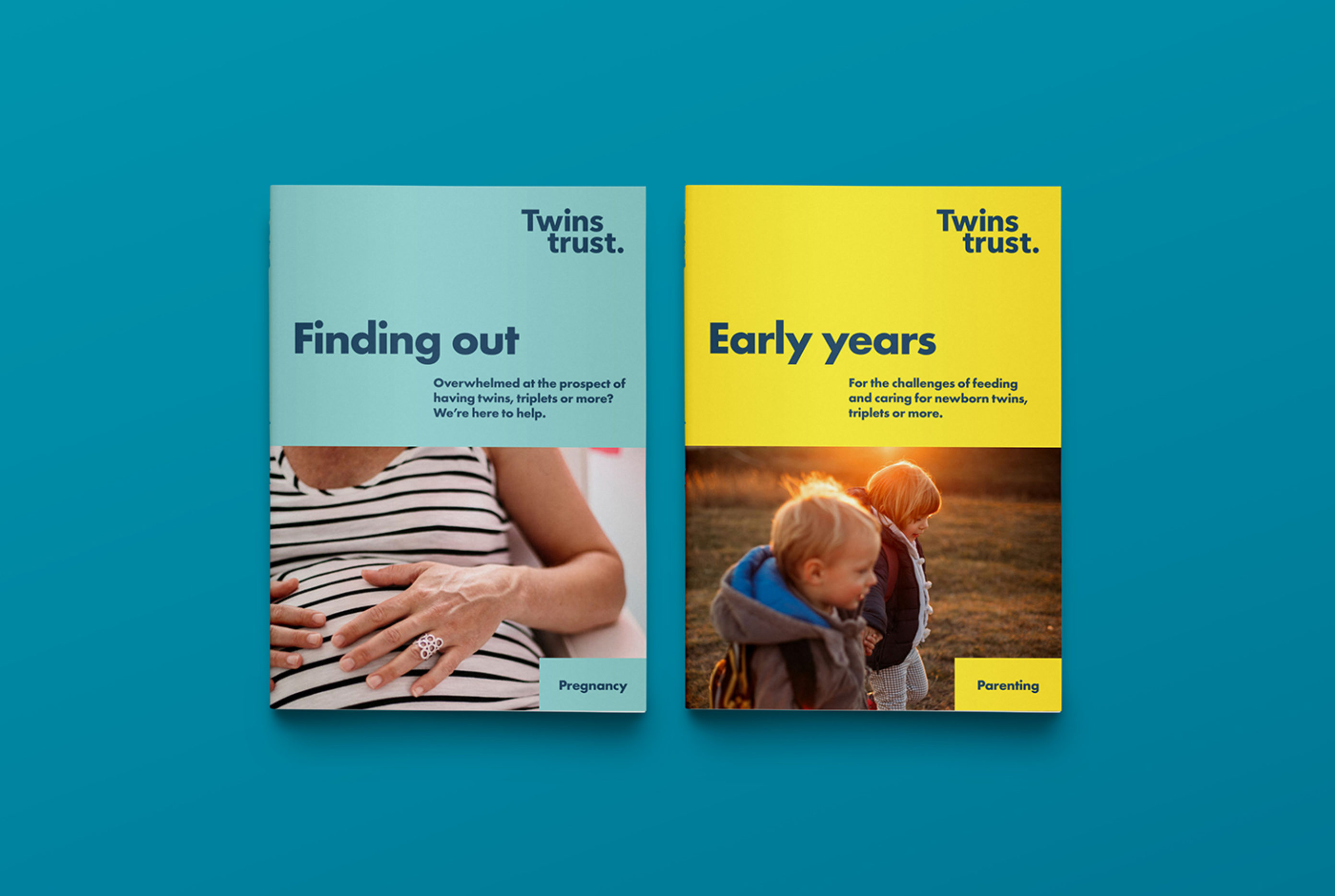
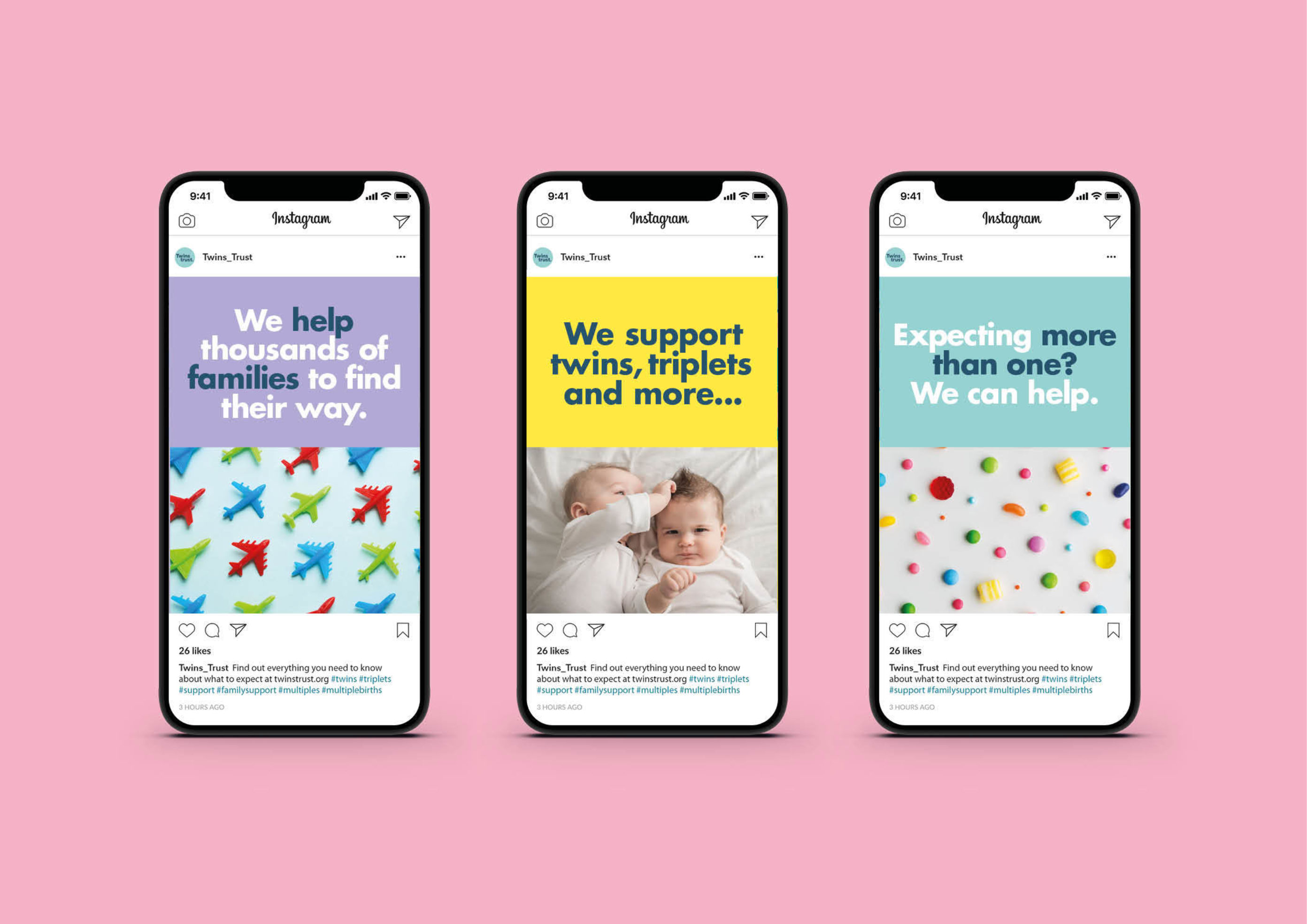
As well as a new brand identity, we refreshed Twins Trust’s digital and printed media, which has given the charity a more vibrant and distinct personality. This is a vital part of the charity’s mission to attract more members and highlight the unique needs of multiple birth families.
Communicate exactly who the charity is for
Our analysis work showed that there was strong internal loyalty towards the Tamba name, but that people also felt a new name could help to increase growth.
Although membership had been steadily growing, with almost 11,000 multiple births each year – mostly involving twins, who account for 98% of multiple births – the pool of potential members is constantly renewing.
We proposed the ‘Twins Trust’ name to instantly communicate to parents and wider audiences the purpose and intended audience of the charity.


“It’s been quite a journey working with Red Stone. They challenge you and your whole team as no stone goes unturned in the pursuit of finding the best concept for your organisation. It’s hard work. And it’s well worth it. The results are fantastic and will stand the test of time.”
Keith Reed, Chief Executive
Related
-
Creative strategy and brand development for a leading pension provider
Nest
Creative strategy and brand development -

Taking action to eliminate problematic single-use plastics
WRAP
UK Plastics Pact campaign -

Brand identity refresh
Bank of England
Brand identity refresh -

A behaviour change campaign with a bit of bite
WRAP
Complete eating campaign