As the Bank of England's contracted creative agency, Red Stone were appointed to review the Bank's brand identity.
Along with the Bank's creative team, we established that a clearer brand hierarchy and identity system was required to enable the Bank to deliver outputs and communications targeted to its varied audiences across the world.

Adaptive logos
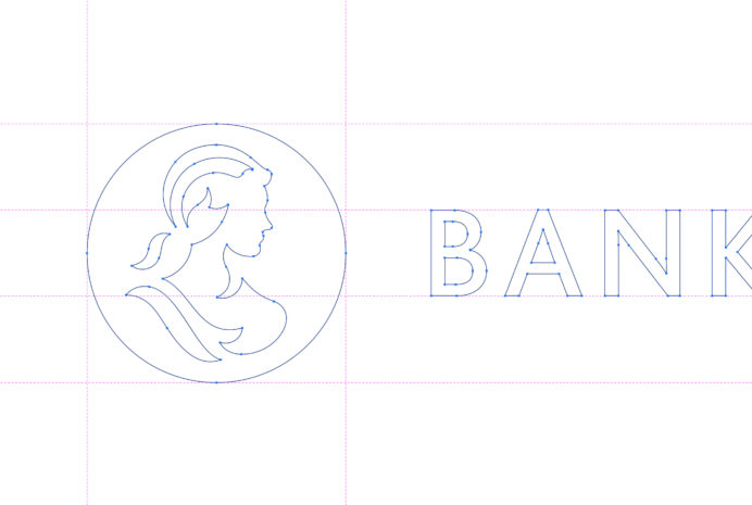
It was a comprehensive review, and as part of the process we developed a new iteration of the core Bank of England logo, to maximise impact and recognition across digital platforms.

New visual brand resources
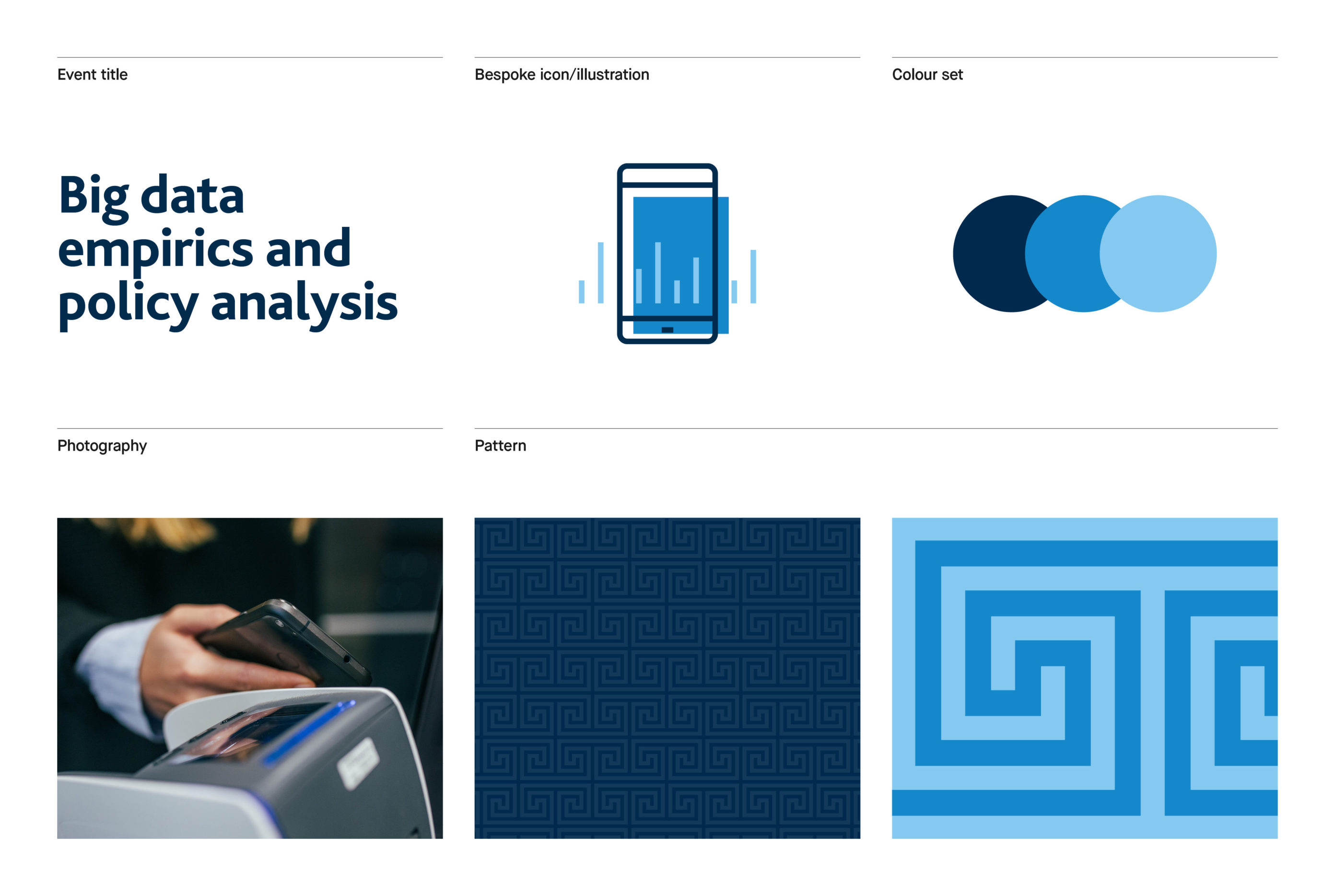
Taking inspiration from the distinctive architectural and decorative details of the iconic Bank of England building on Threadneedle Street, we created a series of patterns to be used as visual brand assets.
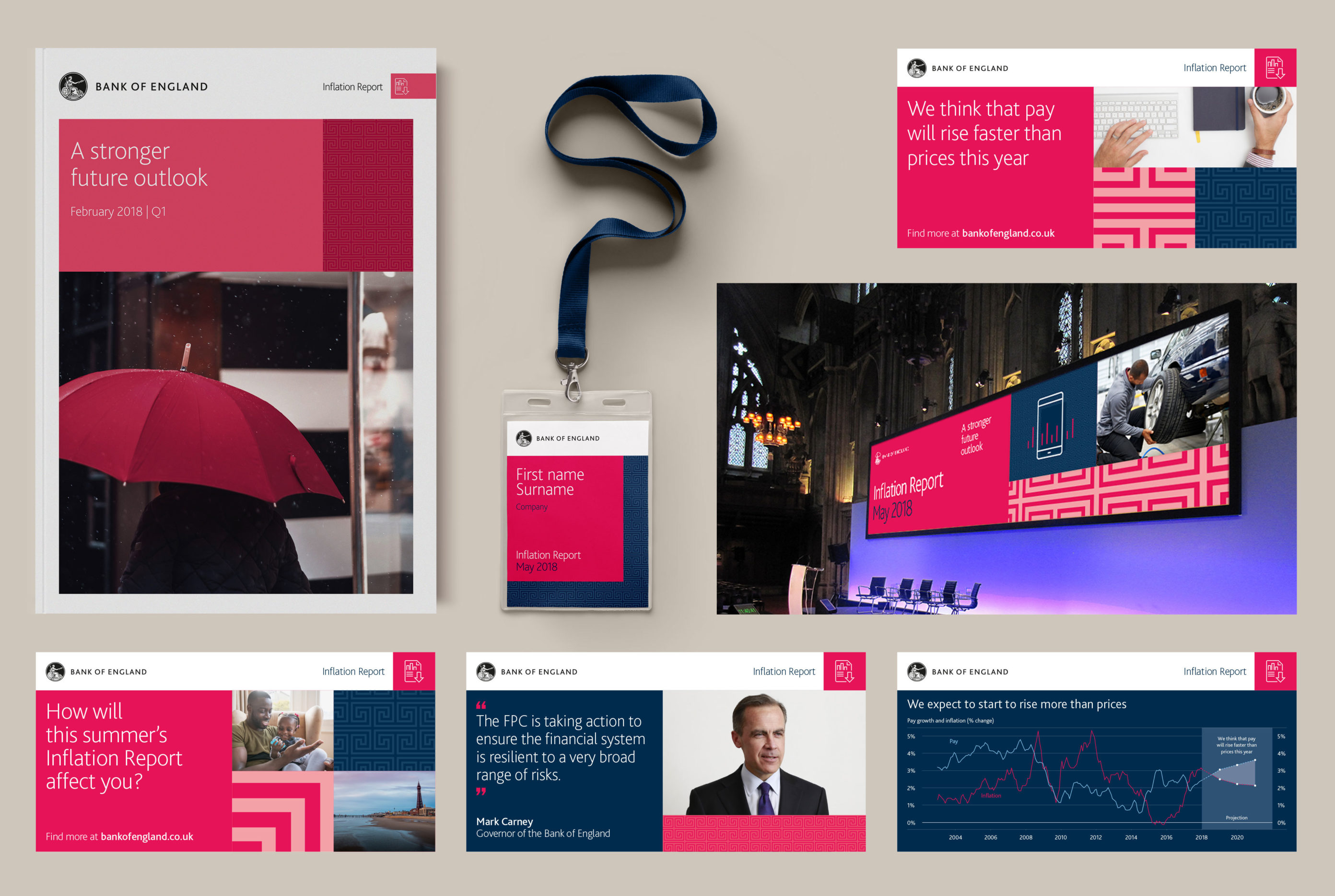
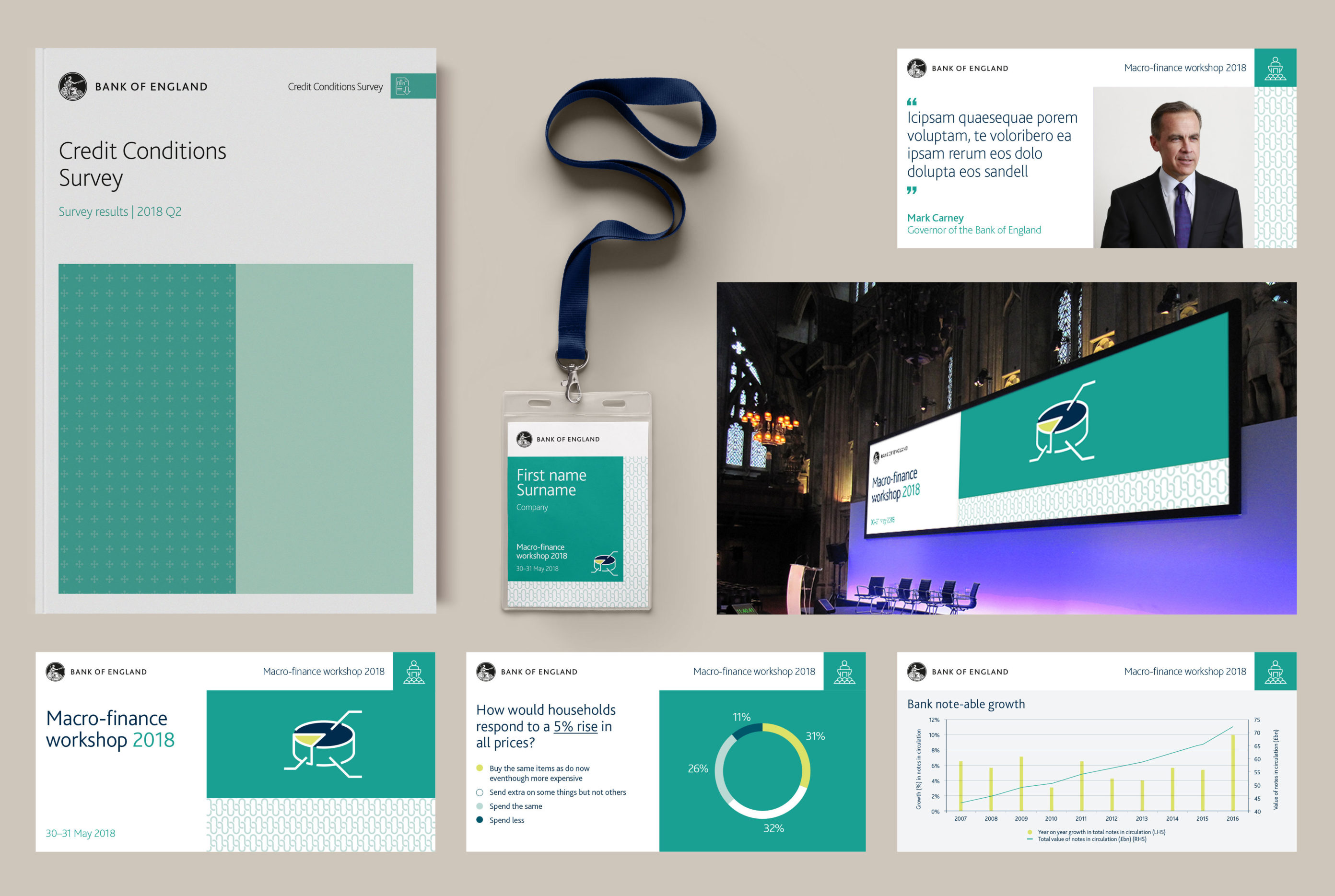
Along with a colour palette derived from the colours of British banknotes, Red Stone developed a graphic system for creating a wide range of distinctive communications materials.


Brand expression
Red Stone created a flexible graphic approach equipping the Bank with a system to develop content for each of its core audiences in a distinct, yet coherent voice.

Events
The Bank runs numerous events across the UK, from school visits to global conferences. Our graphic system was developed across the suite of conference deliverables.


Education
The Bank of England's education team required a slightly different creative approach for their resources. We created a suite of blends, taking inspiration from the banknote holograms, for use across resources, events and competitions.


Related
-
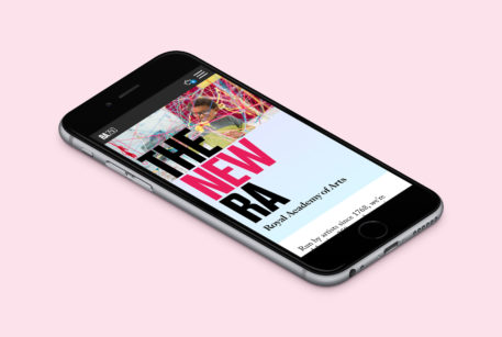
A new face for the Royal Academy of Arts
Royal Academy of Arts
Website refresh -

Brand strategy and implementation for an independent charitable foundation
Medical Research Foundation
Brand strategy and identity