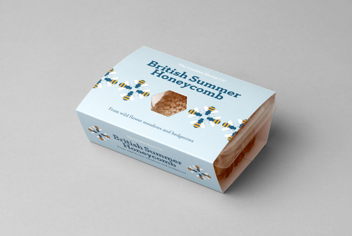
Cut straight from the hive
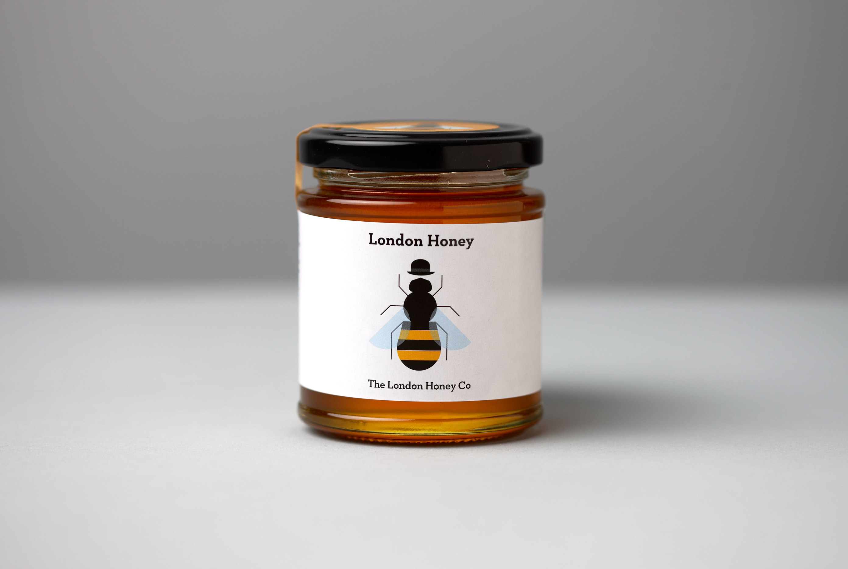
With a bumper crop and a selection of honeys becoming available, Red Stone were asked to design a range of distinctive packaging.
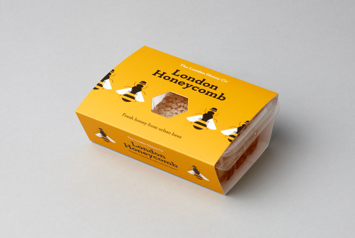
Cut straight from the hive, honeycomb from the London Honey Company is a delicious treat – honey in its most natural state. The packaging for this needed to reflect the unique qualities of the product with maximum impact and minimum fuss.
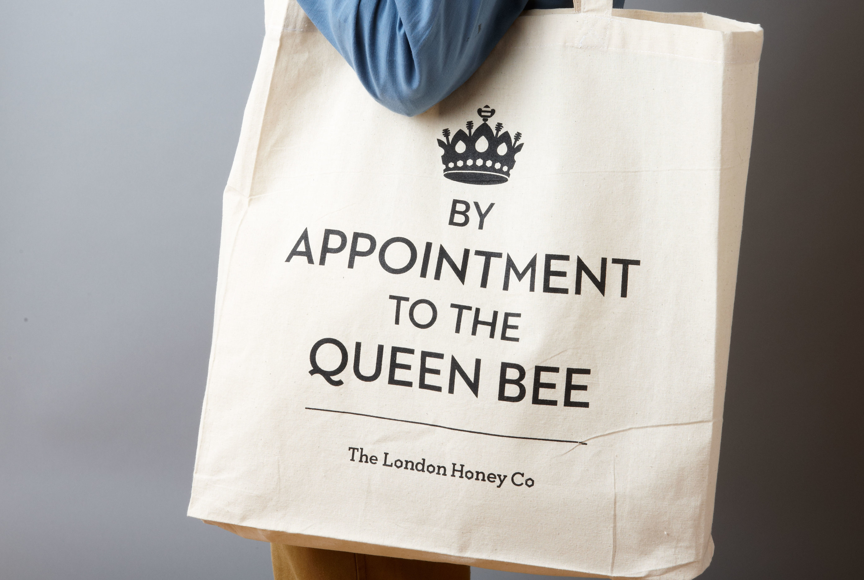
Sold by the UK's finest food purveyors
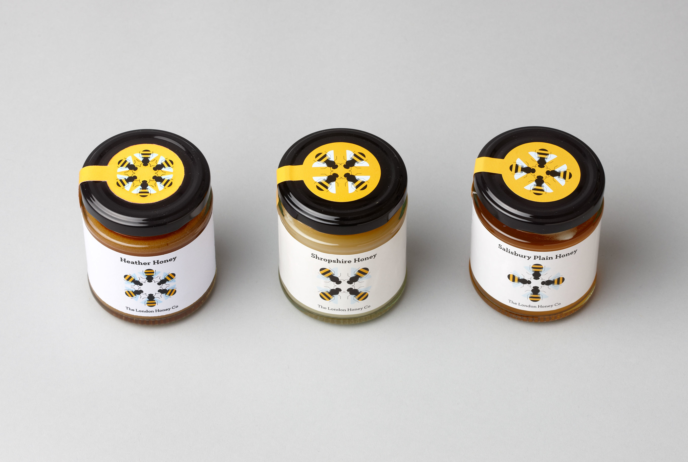
Alongside the core jars of London Honey we also produced packaging for a small range of speciality honeys from hives hidden in locations across Britain. Available from some of the UK's finest food purveyors; Harvey Nichols, Fortnum & Mason, La Fromagerie and The Savoy Tearooms – these labels show the country cousins of our City-worker bee.
Brand sting
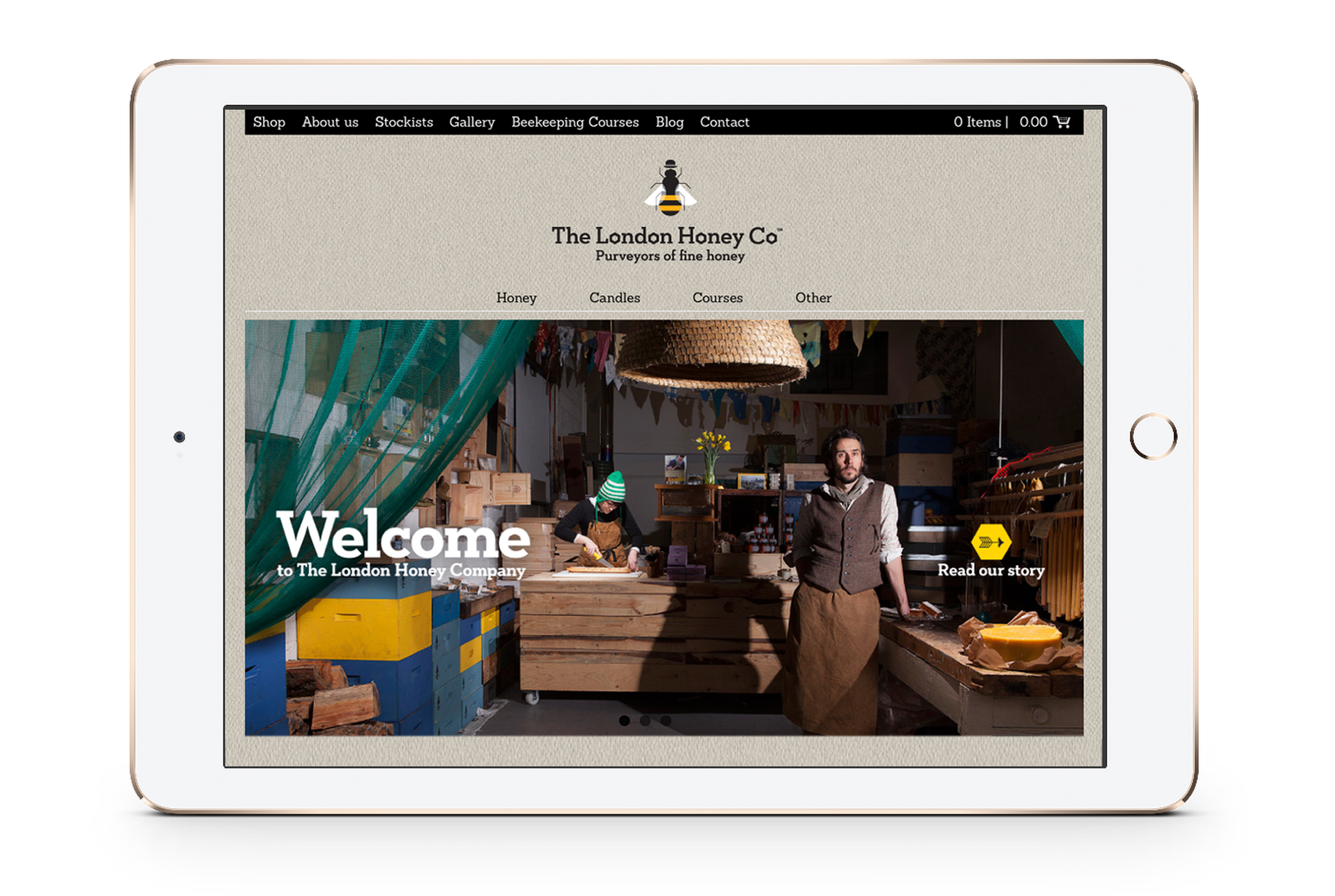
When we originally developed the site, we suggested having a short film to capture the essence of the brand. It has proved to be very popular and we’ve since made several brand films for other clients.
Related
-
Branding for an exciting new heritage project
Ashfield District Council
Brand identity -

Brand strategy and implementation for an independent charitable foundation
Medical Research Foundation
Brand strategy and identity -
Identity and website for one of London’s more unusual museums
Old Operating Theatre
Identity and website -

Reinvigorating a charity’s brand
BookTrust
Brand strategy and identity