A better way
‘There must be a better way’. Paul Hamlyn, the publisher and philanthropist, took this phrase as his personal motto, and this underpins the values of the Foundation he established in 1987.
At a glance
Annual reports
Infographics
Impact reports
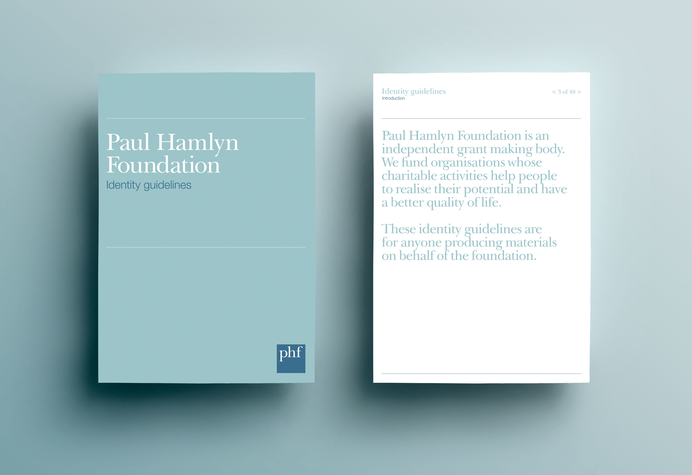
Identity development
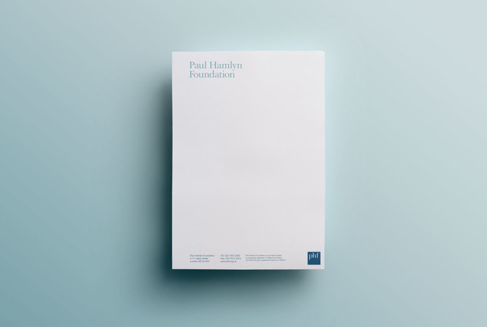
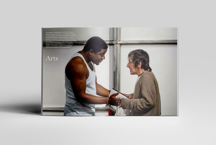
Printed material
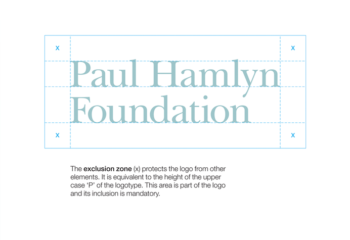
Brand identity
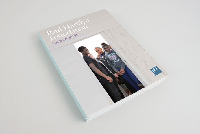
Red Stone was initially brought on board to develop the Foundation’s visual identity, and have since produced all their yearbooks.
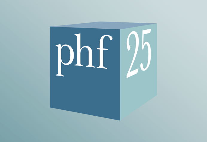
The Foundation was 25 years old in 2012. In parallel with the annual Yearbook we design and produce for the Foundation, we were asked to develop a mark to celebrate this milestone. We added a new dimension to the ‘phf square’ device which is used across the website, social media and printed material. We have since developed a mark for the Foundation’s new strategy for use on their blog.
Reporting and infographics
In order to report more accurately on the outcomes of grantmaking, PHF commissioned us to design an impact report. Grantmaking isn’t an exact science, so expressing these outcomes in a simple and meaningful way required an infographic approach to illustrate the finer points.
Related
-
Clarifying external and internal comms
Client story
The National Lottery Community Fund -
Highlighting the ‘plight of the bumblebee’
Client story
Bumblebee Conservation Trust -
Digital brand extension for a national institution
Client story
Royal Academy of Arts -
Matching craft with creativity
Client story
Aldworth James & Bond