Expressing an organisation’s personality
We were recommended to the Tudor Trust by another charitable foundation. Tudor have a very friendly and knowledgable team. Their trustees are closely involved in the projects they fund, visiting them to see how they are putting their funding to use.
We wanted to express this engagement in their new site and other material they produce.
At a glance
Identity
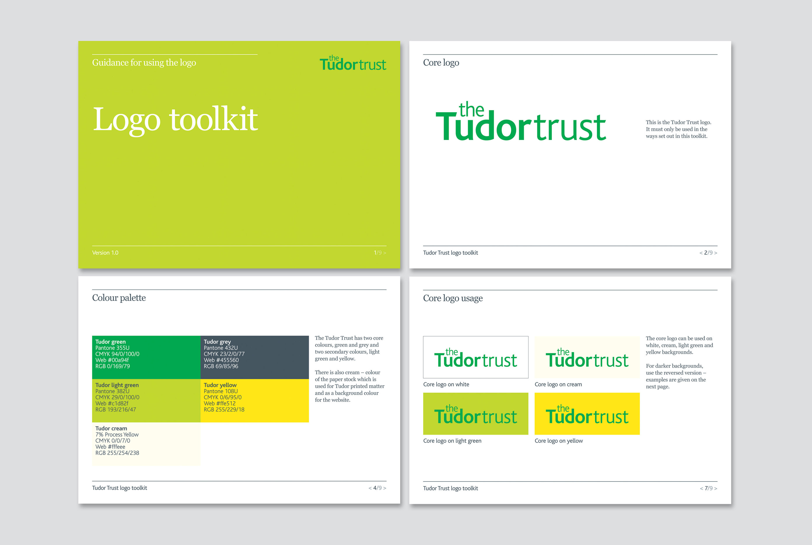
Logo toolkit
Printed guidelines
Website
Identity
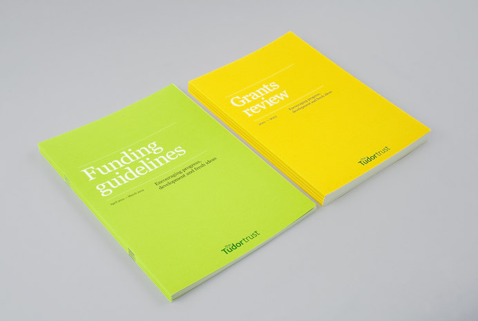
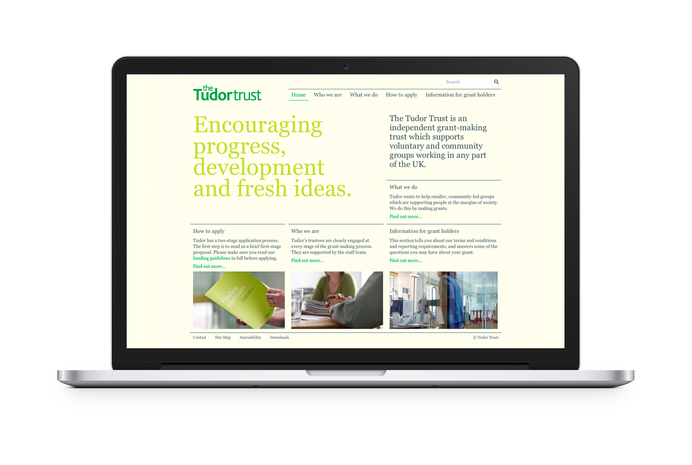
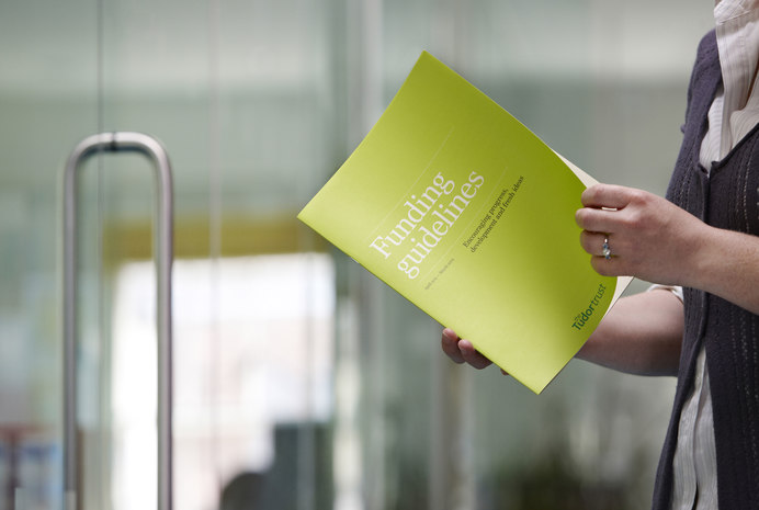
Red Stone took the existing identity, added new colours to the palette and redrew the logotype. We were applying the new identity to printed materials alongside development of Tudor's website, we also introduced a new typeface that works online and offline. While we ensured consistency between the two publications, we identified each with a colour from the new palette to differentiate the two publications.
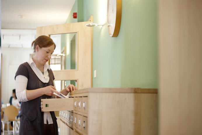

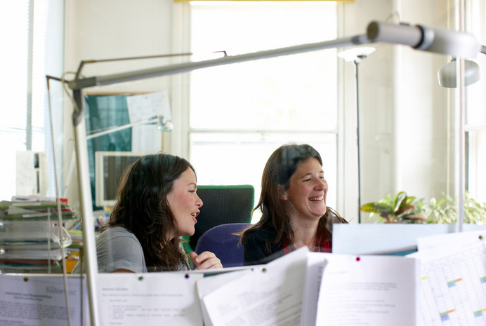
Photography
We art directed a shoot with photographer Patrick Harrison at the Tudor involving all staff and trustees, which gave a ‘human face’ to the Trust.
The new site looks great and we’ve already had some very positive feedback! Thanks so much for slogging away at all the final little issues.
Research and Information Manager
Related
-
Clarifying external and internal comms
Client story
The National Lottery Community Fund -
Strategy and brand creation for a long-established foundation
Client story
John Ellerman Foundation -
Reporting on the legacy of London 2012
Client story
Legacy Trust UK -
Digital brand extension for a national institution
Client story
Royal Academy of Arts